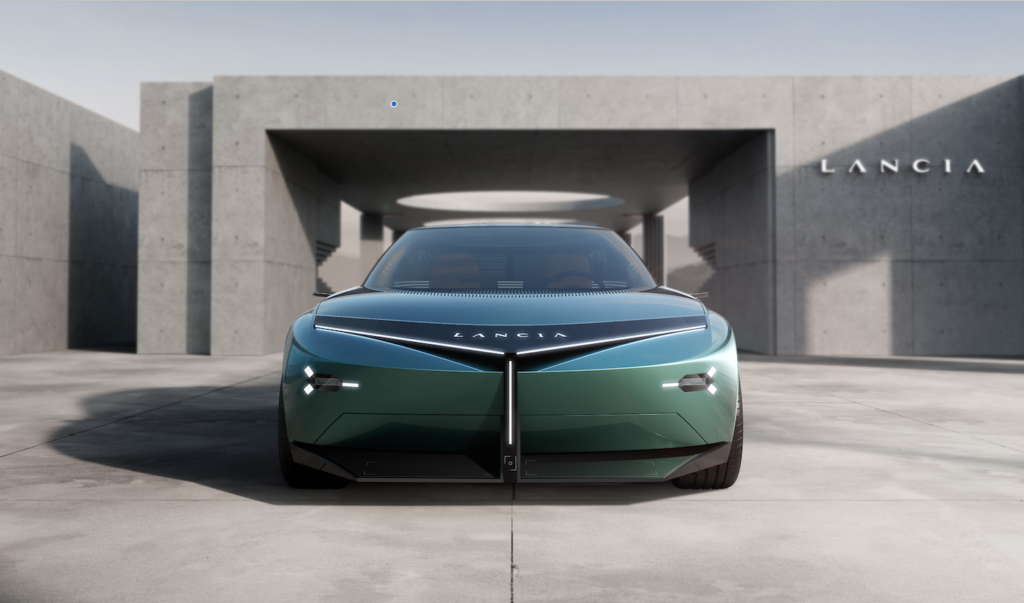
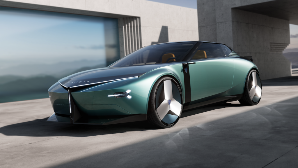
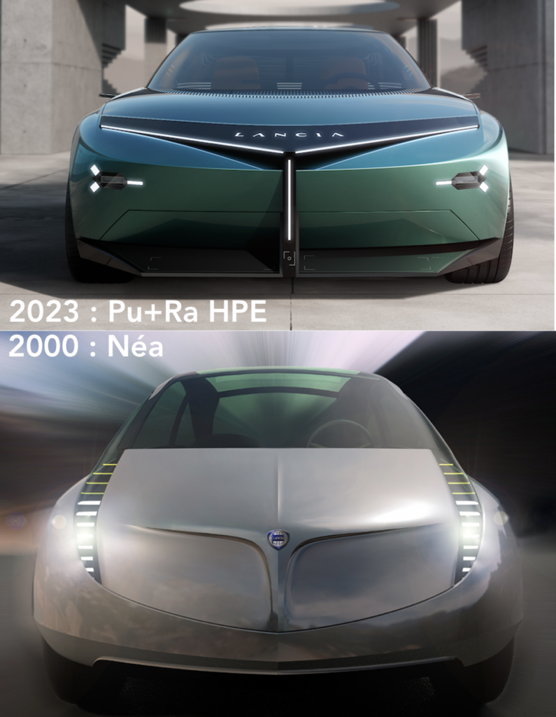
Lancia announced it last November. The new formal language of the brand’s future products “will be pure and radical, with volumes created from the intersection of elementary and emblematic shapes, such as the circle and the triangle.” Circles and straight lines. Muscles, too, that shape the rear wings, and character, above all, for those at the front. The new design language comes to life in the Pu+Ra HPE concept car, which, according to the manufacturer, “is the brand’s manifesto for the next 10 years.“
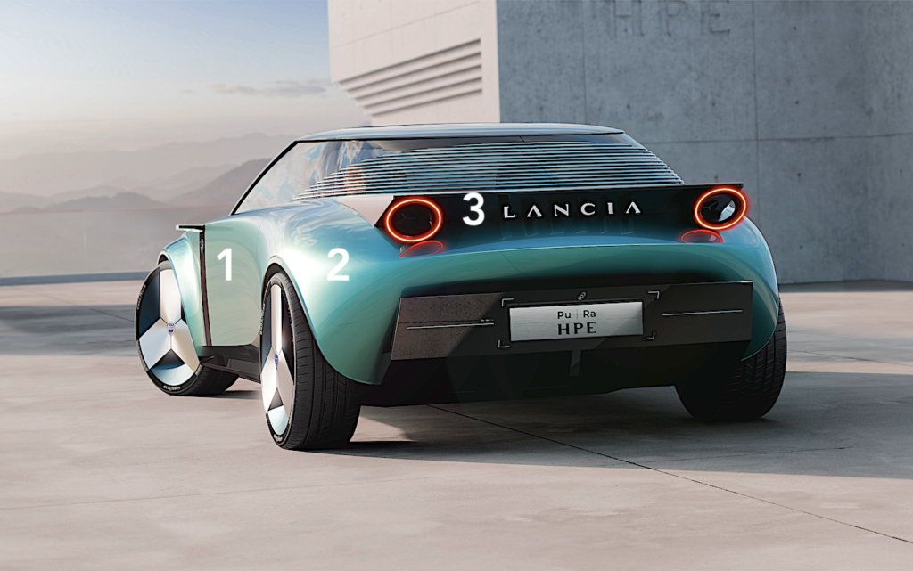
Since the announcement of Lancia’s return to Europe, the Italian teams have been constantly referring to the brand’s icons. But there are so many of them that it could end up being an incoherent mix, because Lancia’s history includes both the Stratos and the Flaminia, the Ypsilon and the Aurelia. Fortunately, the design team decided not to put all these icons in the blender when serving us this tasty cocktail.
During the presentation of the Pu+Ra Zero sculpture last November, Jean-Pierre Ploué – head of design at Stellantis Europe – explained to us how to rebuild this new formal language: “We are taking back the DNA, the value, the codes and above all, no retro design. Lancia will always remain modern. We use typical elements of the brand, such as the round lights that will be present on the Ypsilon, while the front end clearly evokes Lancia’s historical ‘chalice’. We have taken the essential codes and made them into a modern and, above all, sustainable design.“
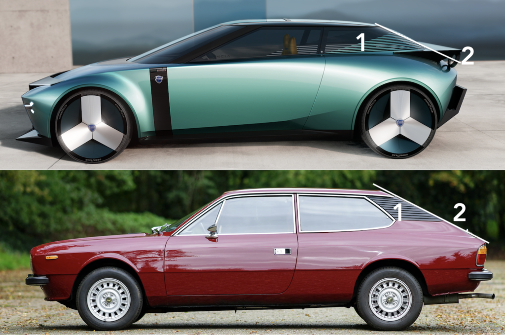
Here are the first clues provided by this new Pu+Ra HPE manifesto (HPE stands for High Performance Electric and not High Performance Estate as in the Beta era) which is the first concrete indication of the progress of the work. This will lead to the launch of the Ypsilon next year, the Gamma saloon in 2026 (4.60 m long) and the Delta in 2028. The latter two will be 100% electric, as is the manifesto unveiled today.
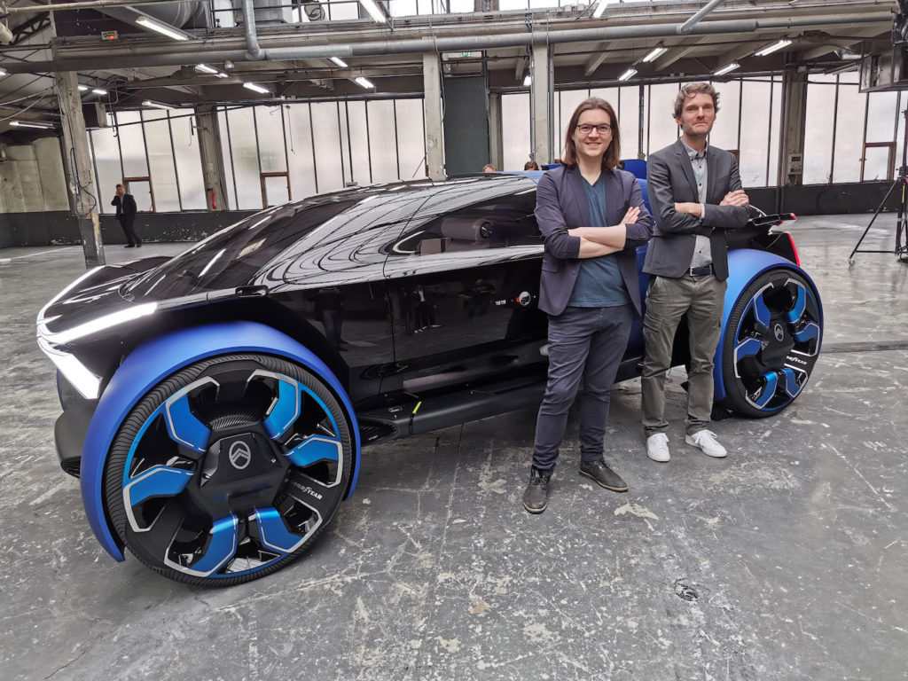
The exterior design is the work of Frédéric Duvernier, one of the few Frenchmen in Lancia’s small, 80% Italian design team. Frédéric is known for his long stint at Citroën where he was responsible for concept cars, notably the famous 19_19 designed by Romain Gauvin for the centenary. Having recently met some people close to Citroën design, the regret of having had to let Frédéric Duvernier go to Lancia is palpable. In the world of the many designers working on the planet, Frédéric Duvernier is to be ranked among the good ones.
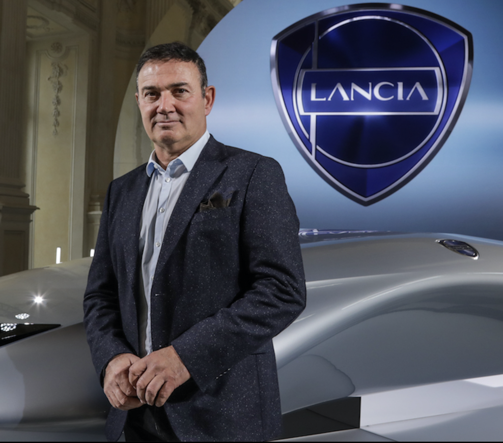
Read the interview with Jean-Pierre Ploué and Italy here: http://lignesauto.fr/?p=26695
No doubt that’s why the great head of Stellantis Europe design, Jean-Pierre Ploué, kidnapped him and entrusted him with the exterior design of Lancia. Jean-Pierre Ploué, it should be remembered, is responsible for the design of the Italian brand in addition to his aforementioned duties. What a combination of offices!
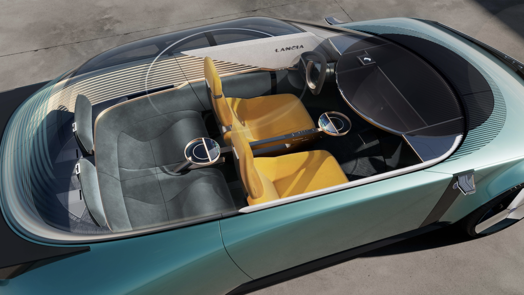
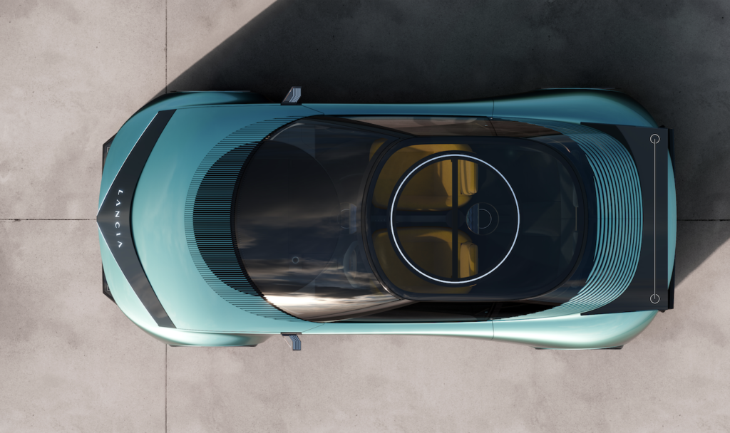
Let’s just say it right away: after discovering the Pu+Ra HPE concept, we are under the spell of the interior design. As for the exterior design, without being as distinctive as that of the Peugeot Inception, it is of a purity that we have not seen for ages. There is no crossover particle here, not the slightest bit of bevelling, not the slightest lie about the identity of the product: an elegant, light, pure and singular four-seater coupé.
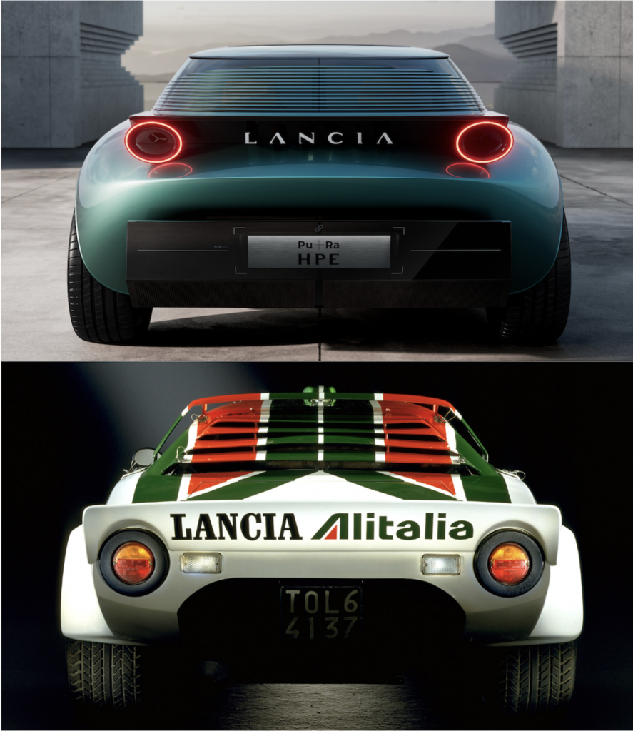
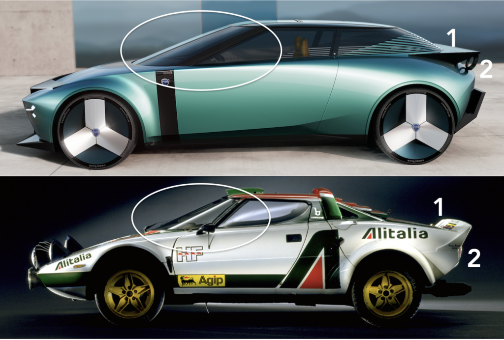
Does the name Lancia come to mind when you see this concept? Not necessarily obvious, except from ¾ rear where the design is inspired by the racy styling of the Stratos. For the rest, our visual comparisons on this site provide some answers.
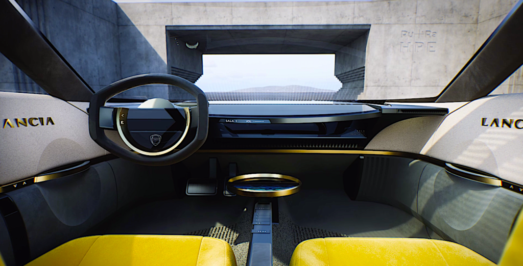
We’ll skip the technical aspects. We note that the range of 700 km for this compact car (4.45 m in length, which is the equivalent of a DS4 to within five centimetres…) seems largely sufficient. It should also be noted that the virtual interface on board, called S.A.L.A – for Sound Air Light Augmentation – which allows the audio, air conditioning and lighting functions to be managed by a single physical command or by voice command, will be previewed for the Lancia Ypsilon model of 2024.
Lancia has the honour, like DS in its time with the e-CMP platform of the 2018 DS3 Crossback, of a technological exclusivity destined for the Stellantis group in the medium term. For a brand that does not yet offer any range, this is strong! LIGNES/auto has always wondered about the next competition of the future Delta and DS4. Both will be housed in the premium segment, both will benefit from the same technical architecture and both will be 100% electric.
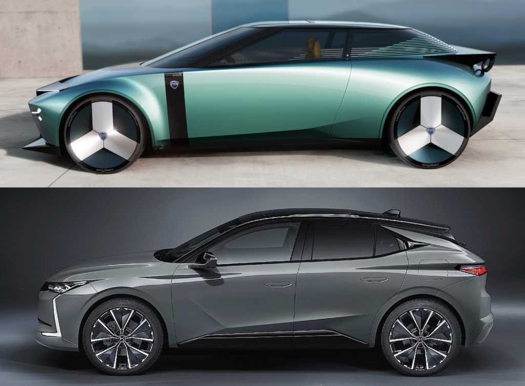
They will target the same market, but not necessarily the same customers. DS will always call on French craftsmanship and know-how, while Lancia wants to apply the specific codes of Italian furnishings on board its next products. Because apart from the style and interior design, the two Franco-Italian cars will be, in essence, the same.

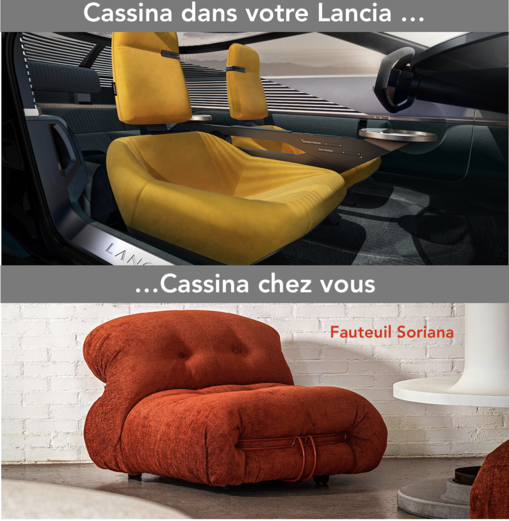
This Pu+Ra HPE concept car announces strong themes in interior styling and in the use of sustainable materials, mostly from interior furniture. The collaboration with the Italian high-end furniture brand Cassina is evident in the HPE concept, but beware, Jean-Pierre Ploué explained to us last November that “Lancia and Cassina designers see each other, but in no way do our designers design Cassina products and vice versa, Cassina designers will not design our interiors.”
The interior design is in line with the exterior codes thanks to the use of iconic and simple shapes that depart from the typical automotive language. Here we find the circle with information gently invading it.
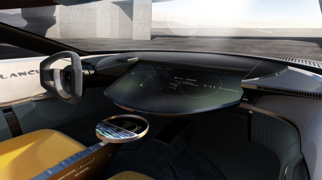
First of all, the central screen which acts as a dashboard and can be tilted at will (above). It breaks with the automotive approach and is made of a single piece of round glass. Visually, it extends outwards, with cosmetic work on the front bonnet. This continuum between interior and exterior design (below) is rarely worked on by design studios and here it takes shape with elegance and creativity.
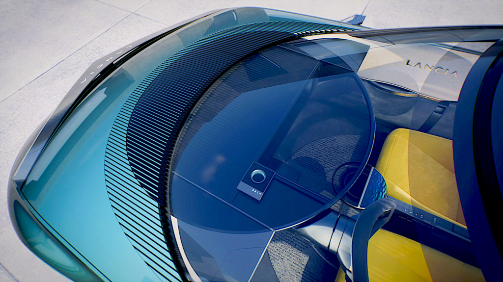
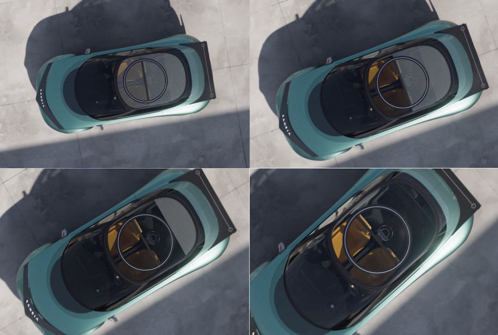
The circle is therefore omnipresent and forms the control of the S.A.L.A. system at the front and also at the level of the rear passengers. Finally, this simple geometric shape can be found in the door mounts and, above all, in the new rotating sunroof.
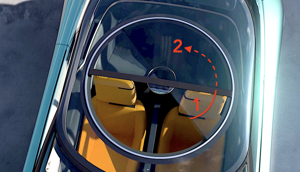
All glazing is opaque. It interacts with the S.A.L.A. control system and acts like the sails or shutters you would use in your home. The manufacturer specifies that “the inspiration of Italian furniture is evident in the front seats, inspired by Cassina armchairs and treated as two iconic, unique and independent armchairs, with bold proportions and colour treatment.” We love it.
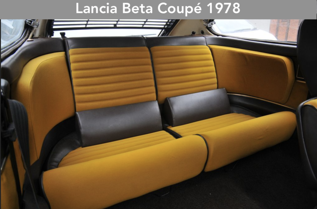
As for the colours, we are delighted to see the daring shades – offered on board the Lancia Beta Coupé and HPE of the mid 1970s – beautifully reinterpreted.
The door panels are covered with a material made from 50% crushed marble waste and integrated into a recycled, waterproof fabric that can be seen flowing through the cabin and onto the bodywork!
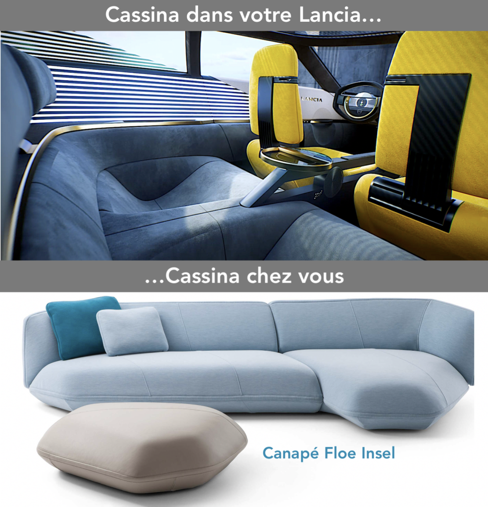
The rear deck wraps the seats in a warm, contemporary wood inlay made from recycled raw materials. The entire rear of the car and the lower part of the cabin are covered in a warm and comfortable velvety nubuck, produced in Italy in a certified chrome-free supply chain.

After the Inception manifesto which marked Matthias Hossann’s takeover of the design for a new Peugeot era, it is Lancia’s turn to proclaim its return to the European market loudly and beautifully. Let’s add the Citroën Oli, on the Citroën side. These are three beautiful (and expensive) visions of the future of the car at Stellantis.
But in this festival of rebirth or mutation of certain Stellantis brands, there is still no news of Fiat. François Leboine, ex-Renault, who is in charge of design, must be impatient to show the evolution of the Italian brand which has already frozen the “New-Panda”. The latter will be much more imposing than the iconic 1980 urban car. Just like the next Lancia Ypsilon, which will also grow in size…
Read more about Lancia’s future styling here: http://lignesauto.fr/?p=27058
