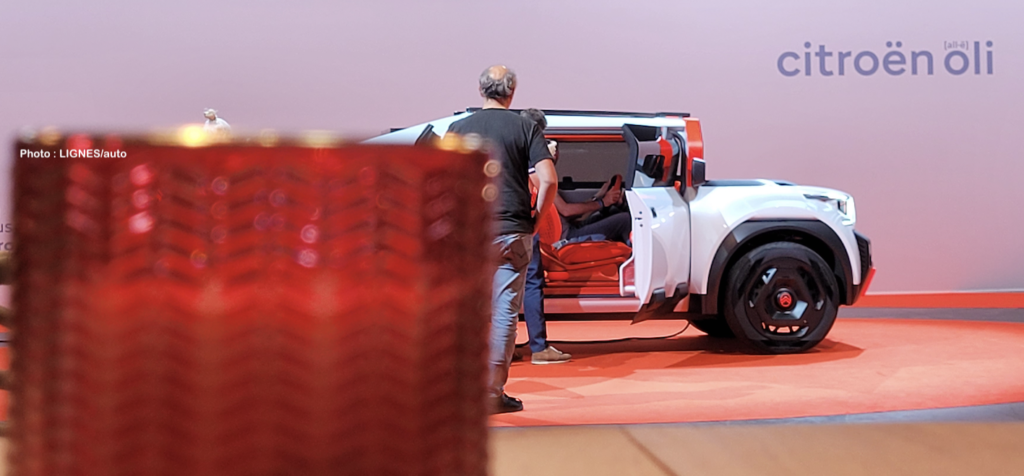
Two days after unveiling its new identity (see here: https://lignesauto.fr/?p=26002), Citroën has unveiled the Oli concept car – called by Citroën All-ë – which will serve as the locomotive for the implementation of a new formal language accompanying the new oval logo. Oli is not a concept car in the strict sense of the word, but rather a manifesto, as it reveals a multitude of concrete ideas that will spice up future models in the range. In the meantime, it’s OLI day!

Oli is first and foremost a new expression of more sustainable individual mobility for a B-segment vehicle (C3 and 208), with a length of 4.20 m. Unprecedented, because it breaks the codes of the generation of electric cars that are increasingly cumbersome, heavy and complex. Oli does not exceed 110 km/h, remains under 1000 kg, has a ‘small’ 40 kWh battery and its primary objective is to limit its consumption to 10 kWh per 100 km, i.e. a range of 400 km.

Anne Laliron, Citroën’s Director of Future Products, confirms that this study started from a blank page from which “we asked ourselves the right questions to create a vehicle that would enable a family to have a single, affordable vehicle with the smallest environmental footprint. Each component of Oli has been rethought from A to Z with this priority of sustainability, frugality and reparability.
To reach a top speed of 110 km/h, you have to lighten up. In order to lighten the car, the glass surface must be reduced, as it weighs a lot. The vertical windscreen, without reducing the visibility, is reduced and allows the heating of the passenger compartment in summer to be limited. This allows for a more compact, less expensive and lighter air conditioning system.
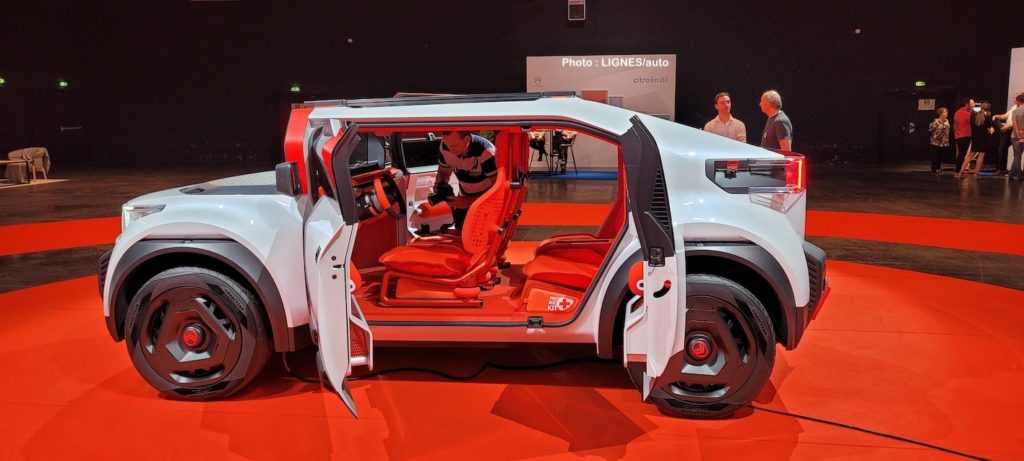
A lighter car means smaller batteries for the same efficiency and a lighter braking system. As you can see, Oli’s magic is to get all its designers (design, engineers, aerodynamicists, etc.) involved in the spiral of a virtuous circle.
That’s all well and good, but what about a production vehicle? We’ll probably have to wait for the new silhouettes of 2024/2025 to see some or all of Oli’s innovations. But not a four-seat, four-door pickup like this one. For the time being, the new lighting identity will appear in the middle of next year. It’s time to decipher the design of this UFO, which respects the brand’s genes.
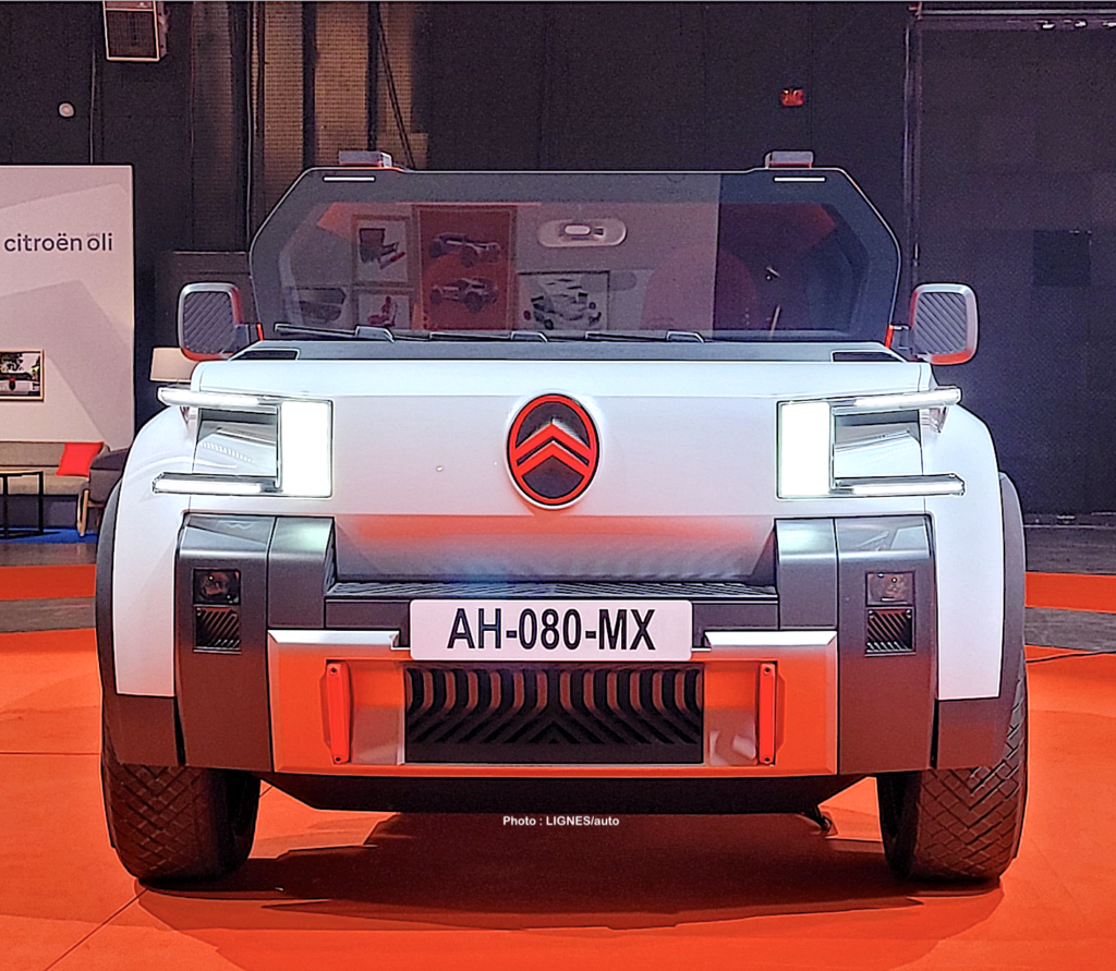
3/4 FRONT
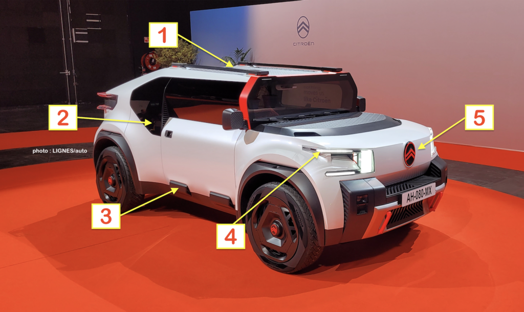
1: the flat roof is made of honeycombed cardboard like the front boot.
2: the rear door window is lowered onto the side of the body, a nod to the C2?
3: the Air-Bump is reinterpreted again
4: the new light signature, with its two horizontal bars and a large vertical light
5: the new oval logo completely redefines the front of future models
Raphaël Doukhan, exterior designer, explains that “we came up with this micro pick-up concept because within this reasonable 4.20 metre footprint, we thought about providing a maximum of uses and a maximum of practicality for everyday life. For example, you can carry a large box in the open space at the rear.”
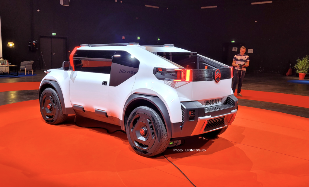
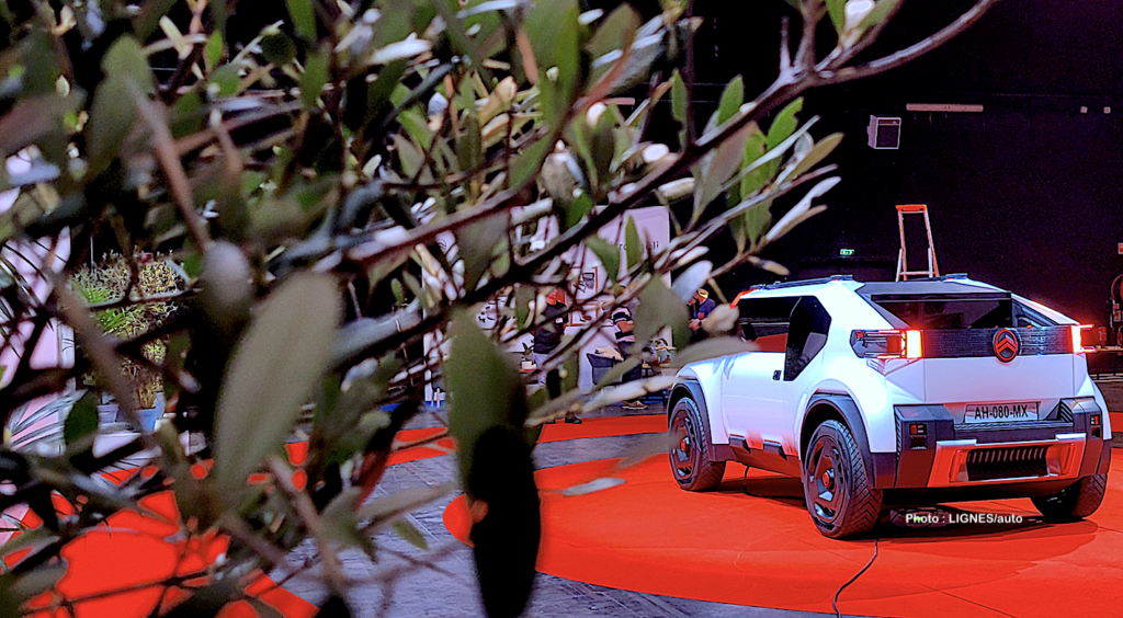
3/4 REAR
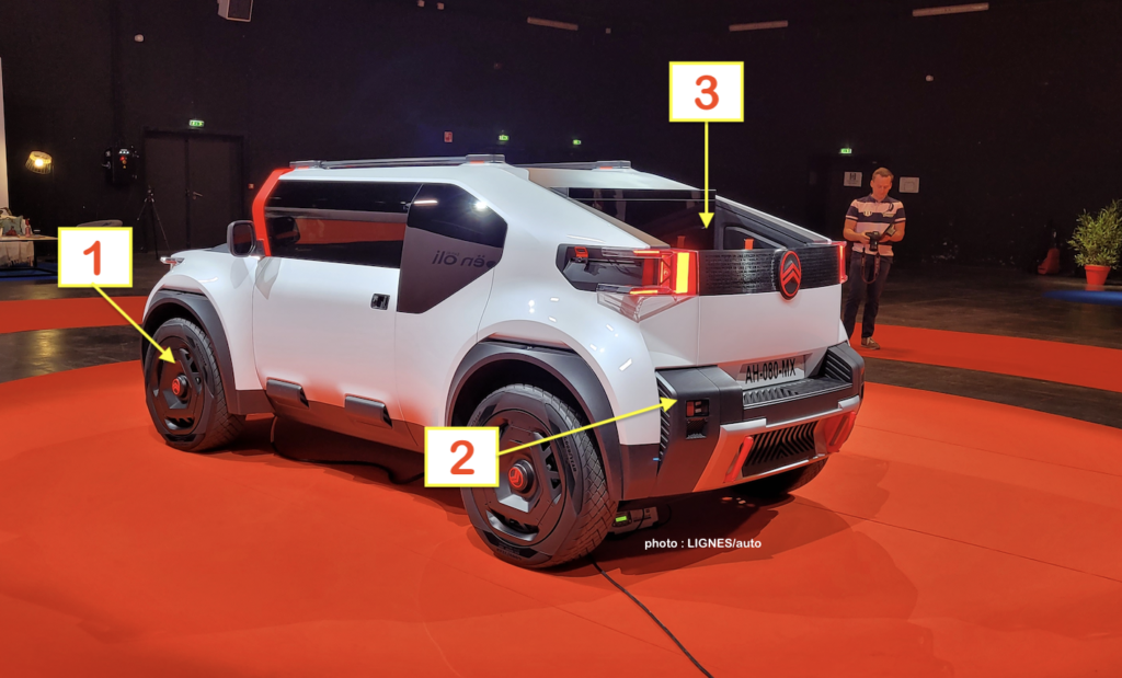
1: the aero wheels have a part of their rim that goes up on the GoodYear tyre
2: the rear bumper is symmetrical with its front counterpart, as are the doors
3: the micro-pick-up concept allows free access to the rear volume
Raphaël goes on to say that “we wanted this manifesto to be sustainable. So we questioned the assemblies, the panel cut-outs, which triggered an extremely simple and pure formal language. We designed flat panes, which are less expensive to produce. The vertical windscreen came from our reflections. We wanted to go further than the aerodynamic drop concepts and reduce the mass of the windscreen, which allows for less weight, less material and higher thermal efficiency with the result being a smaller air conditioning unit.” Such a more compact and unprecedented air-conditioning module on the shelves should probably be shared with… Fiat if Stellantis wants to make it profitable.
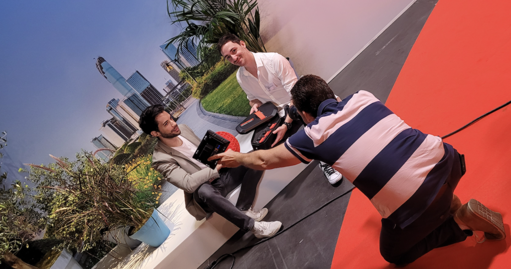
“The formal language is new but we are lucky in our portfolio to have a real palette of expression and to go from the Ami to the C5 X. With Oli, we wanted a pure design, and therefore without an edge line that had no place here. At the same time, the vehicle becomes honest and optimistic.” Raphaël Doukhan.
3/4 FRONT-2
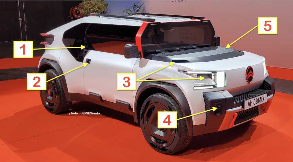
1: the rear door return is designed to ventilate the cabin
2: no electric locks but a new opening system
3: with a vertical face, the aerodynamic air inlets are worked for more efficiency
4: the high beam lights are discreet and housed in the bumper
5: the flat bonnet is made of honeycomb cardboard painted by BASF and is totally rigid
Raphaël Doukhan also points out that “we knew that the question of aerodynamics was going to be raised, so we designed a specific air intake at the front, a device to deflect the vortex that poses a problem at high speeds.“
THE SYMMETRY
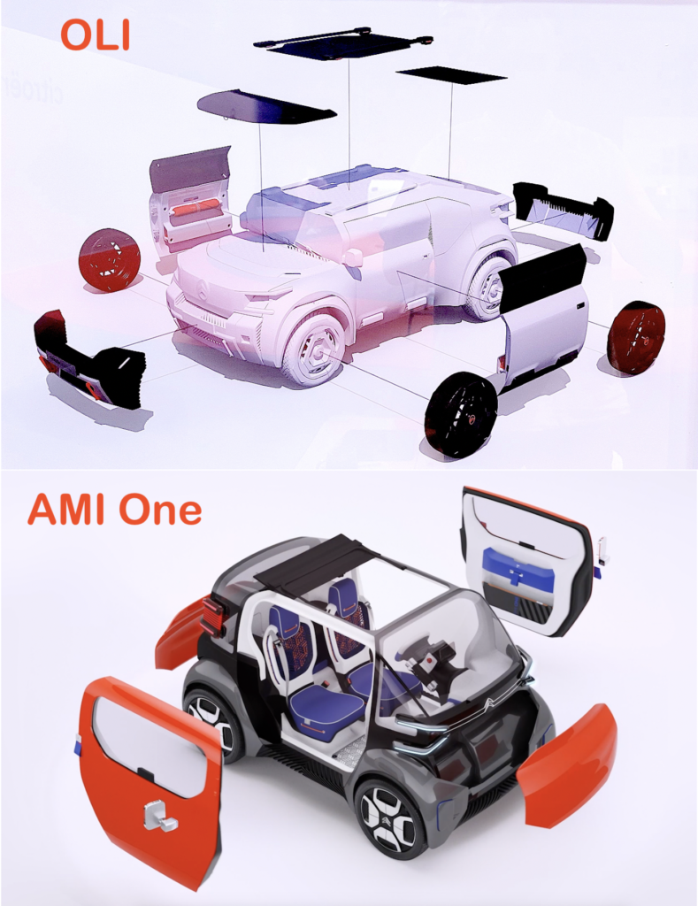
You can tell from the two drawings above that Oli is a big sister to the Ami One. Symmetry is not used on as many parts, but the two identical doors and the two bases of the front and rear bumper are still there. “We brought back ideas from Ami, like the symmetrical doors, and the formal language of the vehicle was born that way.” Raphaël Doukhan.
ON BOARD
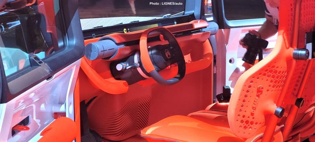
Jonathan Cornu is the interior designer of the manifesto. He obviously goes back to the desire to lighten and simplify the concept to meet the specifications of an accessible, economical, sustainable and recyclable vehicle. “To achieve this lightening, we obviously reduced the number of parts on board and this simplification is a huge job.”
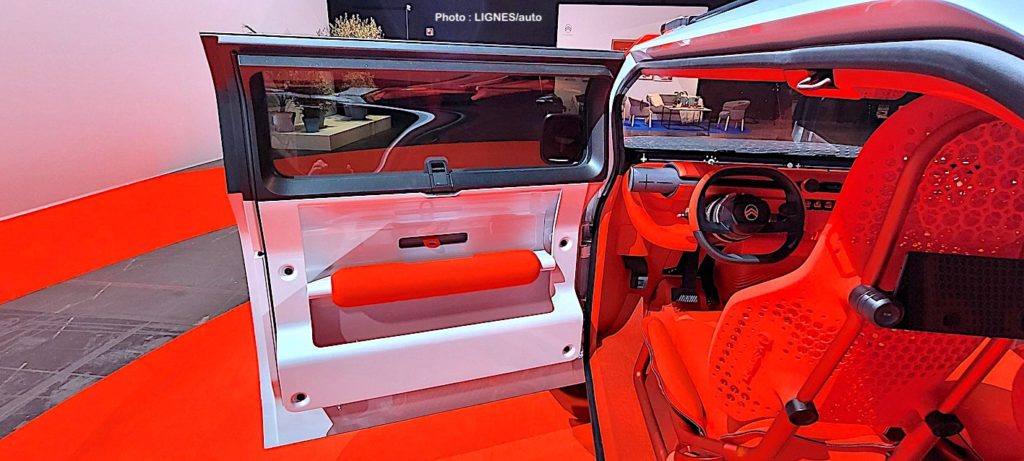
He begins his demonstration with the door (above): “Instead of having a sheet metal stamp, a pile of parts for the medallion, the decoration, the sash, the armrest etc. and rather than hiding the technical parts, which are not necessarily beautiful, we took the opposite approach and highlighted them. They were designed for this and despite the minimalist logic, we did more with less. So all the comfort is on the armrest. The window opens outwards by tilting upwards. In fact, similar to the Ami and 2CV, the entire window mechanism is in the pillar. This frees up a huge volume in the inner door panel.”
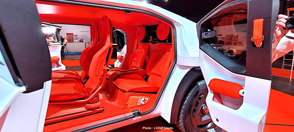
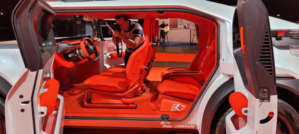
For the seats, the methodology was the same: reduce the number of parts to make them lighter, without compromising comfort. “In production, a seat can have up to 40 parts. We eliminated the foam and took inspiration from the first tubular seats. The structure has been designed to be visible and the comfort element fits over it. The backrests are 3D printed with a pattern that allows flexibility for comfort. The floor is in the same spirit as the mat is similar to a yoga mat rolled out in the car and cut to shape.”
The little wink of LIGNES/auto: when Citroën takes on Jaguar!
With a windscreen that is so high and wide, it was necessary to think about wiping it in the rain. As much as Oli is full of innovations, the eternal subject of windscreen wipers has not evolved one iota on this manifesto. It’s still about using rubber blades and wipers. “And what else do you have to offer LINES/auto?” Erm… nothing really! Nevertheless, with its three windscreen wipers, the Citroën Oli has something in common with the 1961 Jaguar E-type. Nice mobility for the future!

ARCHIVE : The day Walter de Silva (below) signed up with Citroën ! Here : http://lignesauto.fr/?p=17755
