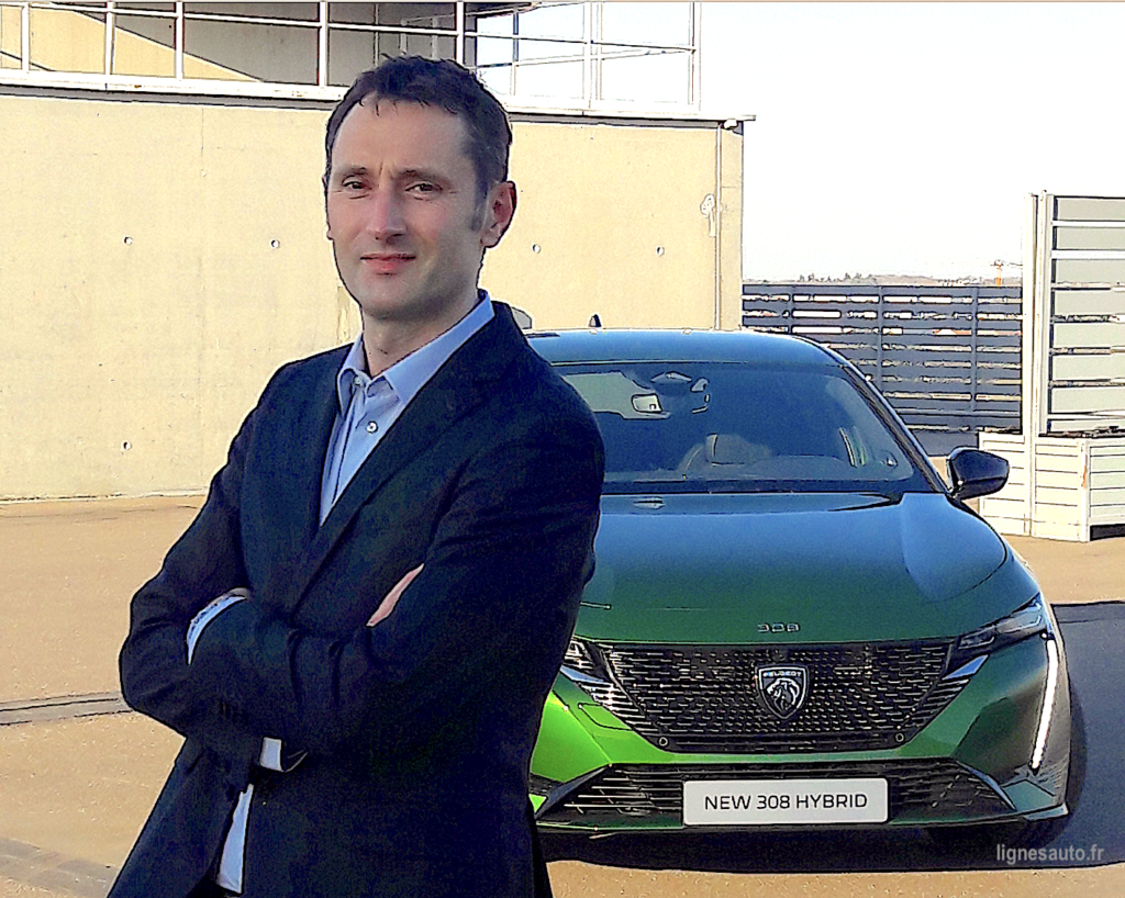
Peugeot has unveiled its new generation 308 and, against all expectations, it is not a simple evolution but a revolution. Why such a change in design? Pierre-Paul Mattei, the Design Manager who accompanied the styling teams on the 308 project, explains in detail the reasons for this conscious choice.
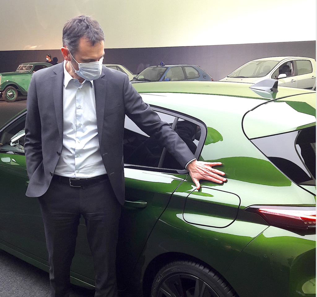
Just 20 years ago, the Peugeot 307 was the first to break with its architecture. In 2001, compact saloons were trying to compete with… MPVs, by offering a large cabin and a semblance of “unibody” style. The 307 from Gérard Welter’s team is thus raised to try to counter both the Golf and the future Golf “Plus”…
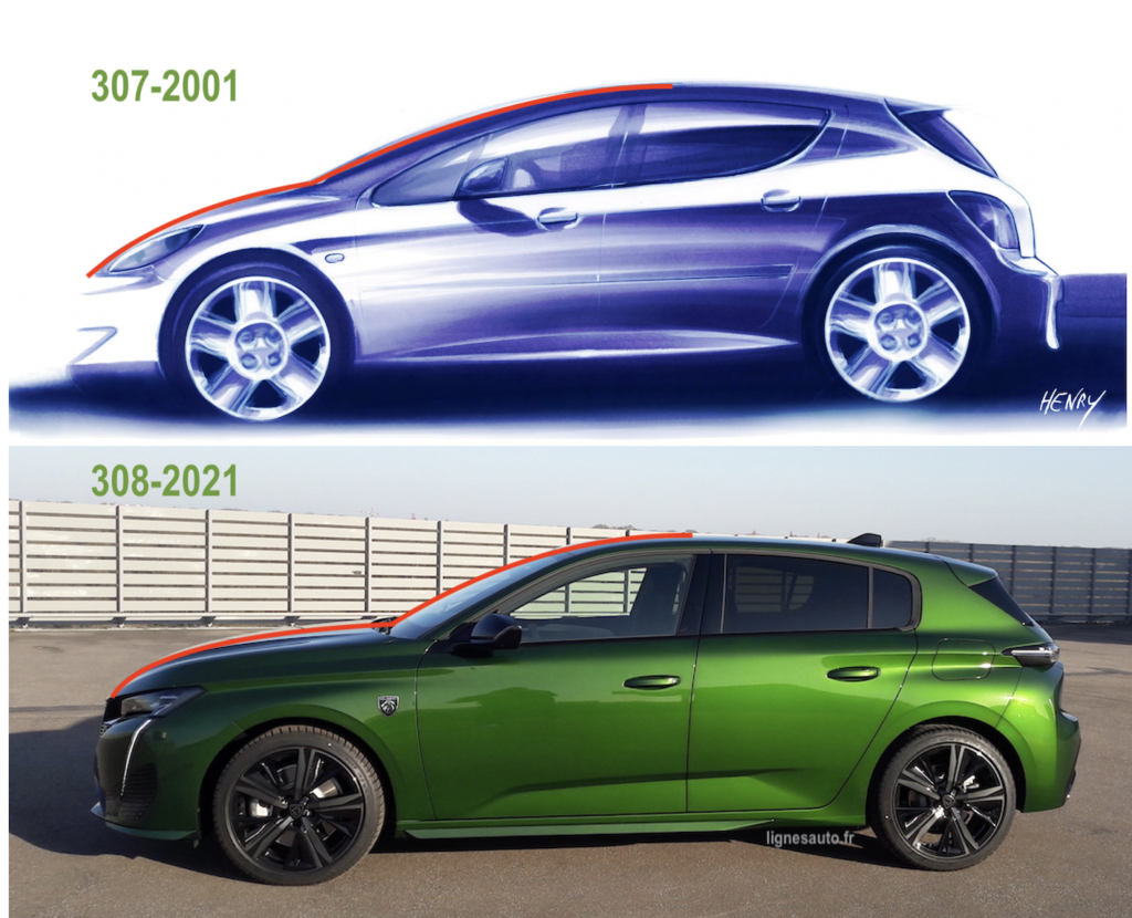
Pierre-Paul Mattei explains to us today that the new 308 plays a completely different role and even moves away from the reference Volkswagen, that of the eighth generation: “the previous 308 was designed according to the archetype of the generalist car and therefore responds to a morphology that plays on visual compactness, leaving the emphasis on the cabin cell with a short bonnet. The premium manufacturers have a different approach, a different morphological balance which plays on the presence of a long bonnet and a cabin pushed back towards the rear.”
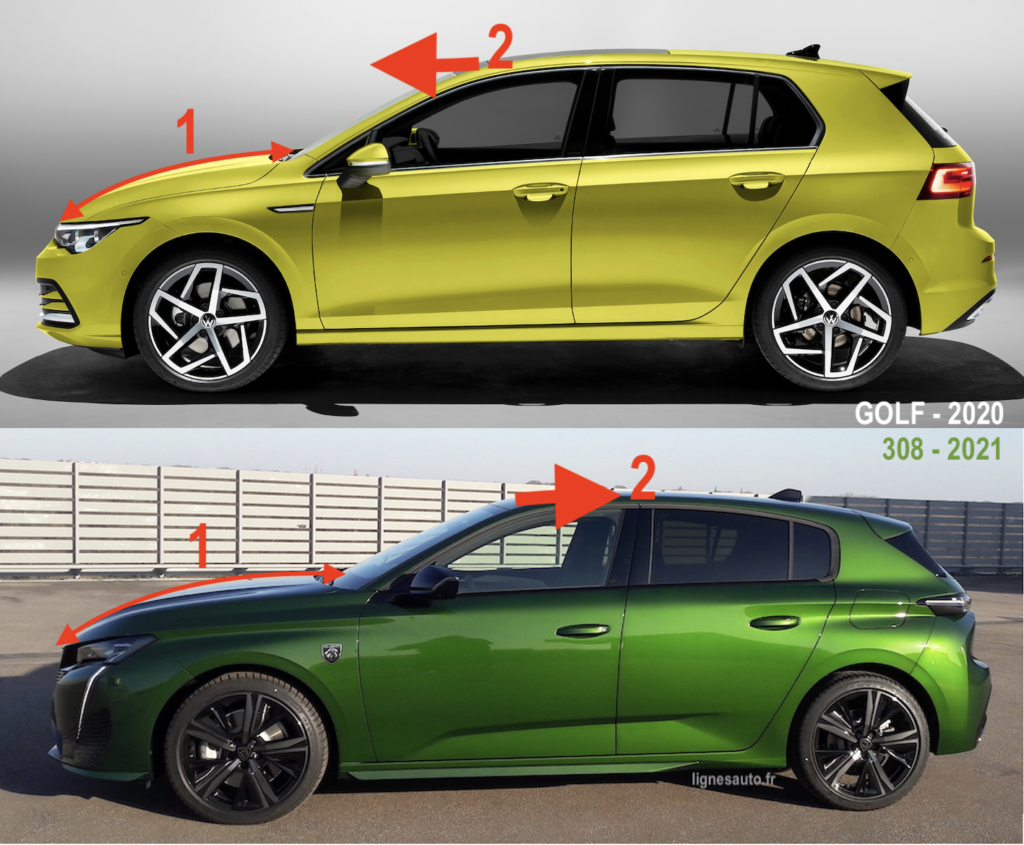
Above, you can clearly see the difference in architecture between the two rivals: in 1, the long bonnet on the 308, short on the Golf and in 2, the passenger compartment which seems to be supported by the front axle on the German car whereas it is supported by the rear axle on the French car.
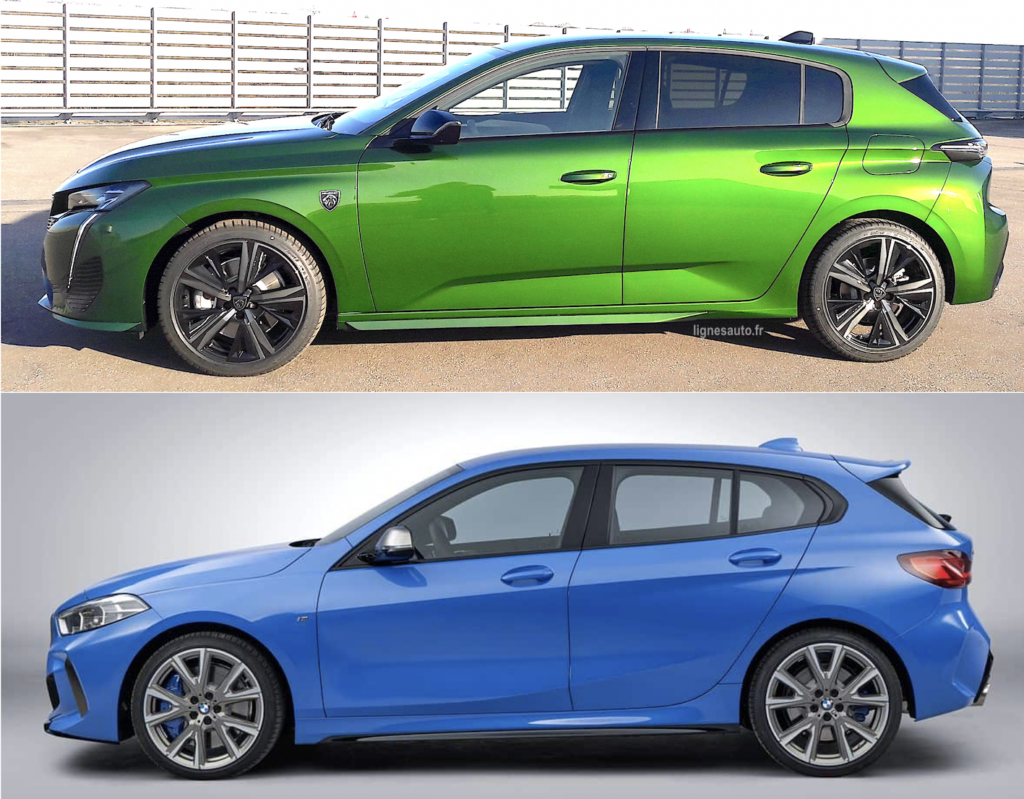
Above: we can see that Peugeot has indeed chosen the architecture of German premium compact saloons, such as the BMW 1 Series, which despite its front-wheel drive architecture, retains the “long bonnet/rear passenger compartment” ratio. The 308 joins it on this theme. Pierre-Paul Mattei confirms that “the windscreen has been moved back 10 cm, the soft nose has made it possible to visually lengthen the car by 9 cm“, i.e. almost 20 cm more in terms of visual perception of proportions.
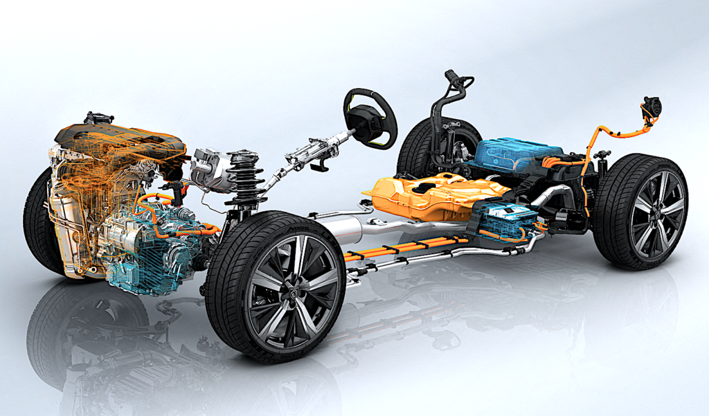
Pierre-Paul Mattei continues: “If we want to move away from the generalist archetype and follow our rise in the range, it starts with the morphology. The new 308 no longer tells the same story. But we can’t change this morphology on our own, technology has helped us with the evolution of the EMP2-V3 platform above that we requested and accompanied.“
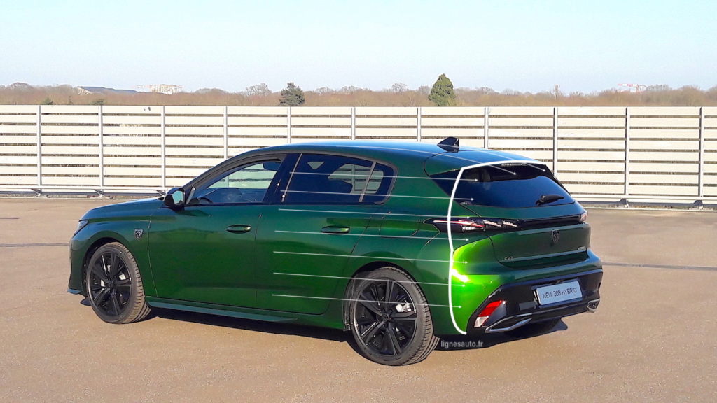
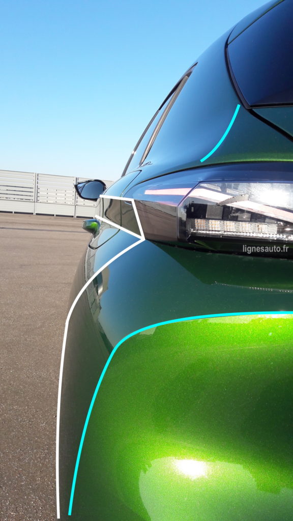
Pierre-Paul also explains that the design of the 308 was largely sculpted by the rules of aerodynamics. The white line around the stern of the 308 above reveals what aerodynamicists call the ‘aerodynamic optimum’ dictated by the wind tunnel. “To achieve our objectives on this theme, we asked the aerodynamicists to provide us, from the three radii of the cabin, sidewall and roof, with the optimal line of cut and flow break, so that we could rely on it and we really built our style on this line.” The result is an SCx of 0.62 and a Cx of 0.32
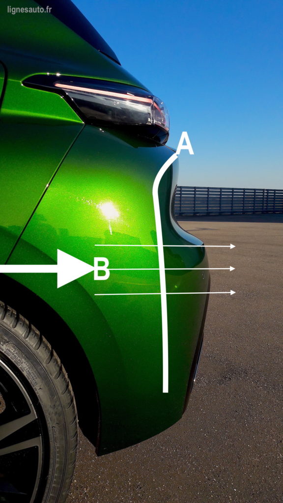
Pierre-Paul Mattei even states “that the design of the rear end has saved two grams of CO2. Efficiency was one of the key points in the specifications of the 308“. It is true that the big boss, Carlos Tavares, has made it a priority to reduce fuel consumption and therefore to improve the aerodynamics… In A, the clean line on the rear bumper allows the threads (in B) to avoid creating vortices at the rear of the car.
DON’T MISS THE LIGNES/auto#03 IN MID APRIL WITH A REPORT ON THE MAKING-OF THE 308 AND AN INTERVIEW WITH THE COLOURISTS WHO RECount THE BIRTH OF THIS LAUNCH COLOUR, OLIVINE GREEN. INFORMATION ON THE PUBLICATION OF THIS NEW BOOK ON YOUR WEBSITE AND ON https://lignesautoeditions.fr
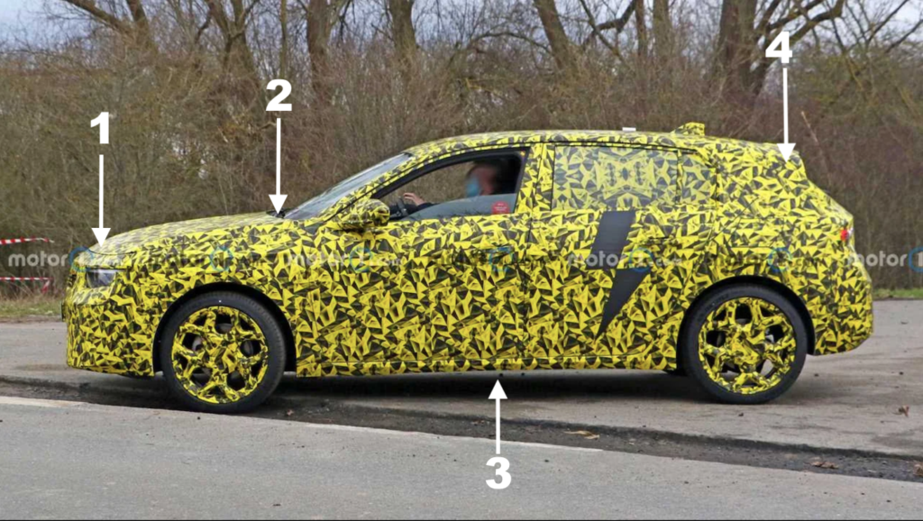
The 308 is the second car from the Stellantis group to use the EMP2-V3 platform. The Opel Astra that will follow will do the same, as can be seen in this document from https://www-motor1-com. The many similarities between the future Opel and the new 308 are :
1- coachbuilt engine bonnet
2- windscreen moved back 10 cm
3- identical platform
4- rear aerodynamic work with long identical spoiler
not to mention some of the glazing, engines, etc.
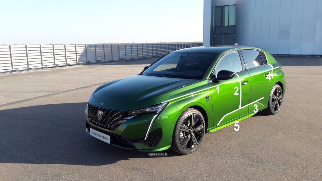
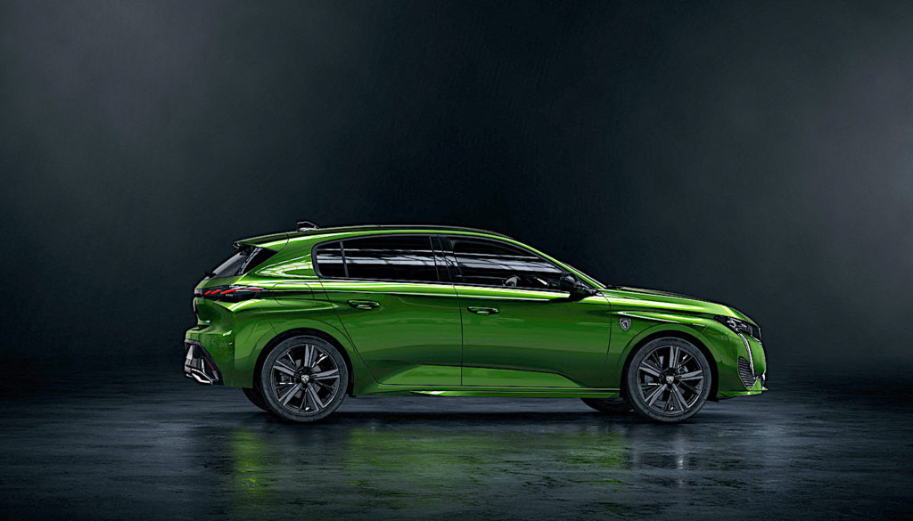
Pierre-Paul Mattei also detailed the sides, for which “we wanted to keep a very Peugeot code. The sidewall is smooth, without any edges, all its character comes from the marking of the two projections at the level of the wings which blend in by supporting the lateral sculpture, it’s very Peugeot.” In 1 and 4, the fender protrusions. In 2, the supple volume of the sidewall. In 3, the light embossing at the bottom of the doors. In 5, a small aerodynamic effect on the GT.
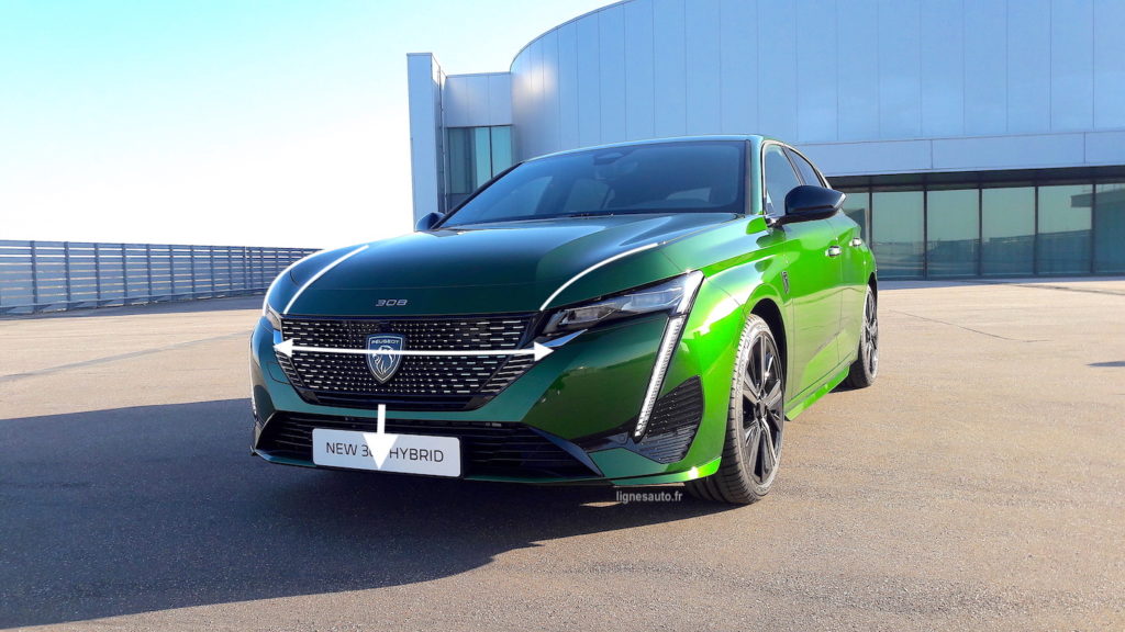
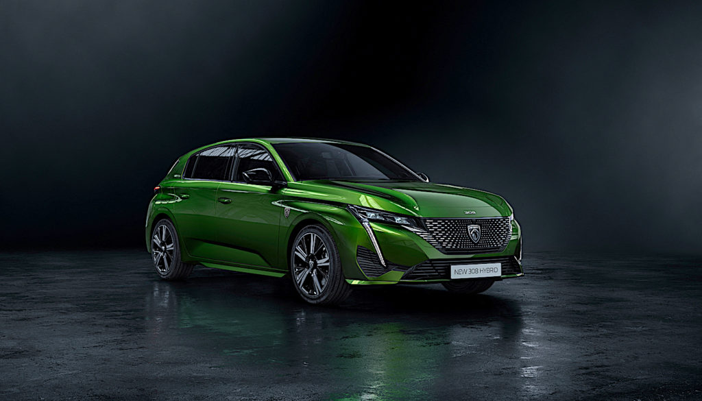
The front end is completely new. “It is the most differentiating element, knowing that the concomitance of the emblem had an impact on the chosen style,” explains Pierre-Paul. The bonnet plunges extremely low over the radiator grille, which makes the new emblem shine. The latter hides the radome behind its 17 cm height. The bonnet is of the bodywork type as on the 508. “There was no question of designing a beautiful car to cut it up with lines. So we used the architecture of the coachbuilt bonnet, and the sophisticated styling volumes start from the bonnet, as on a Porsche. So the bonnet becomes a building block of the car’s style.“
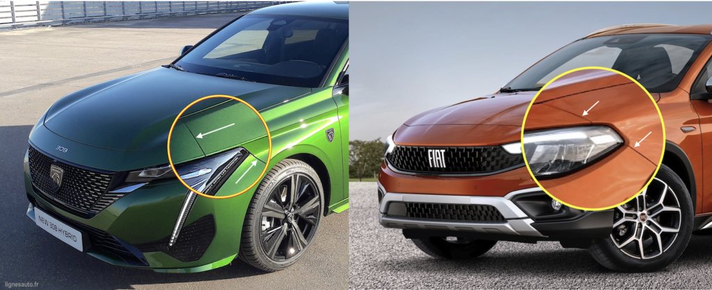
The only regret in a style that has been worked on down to the smallest detail – a regret that we already expressed on the 508 – is that the junction between the soft nose and the front wing is not aligned, as it is on a Mercedes or… a Fiat Tipo! The devil is in the detail! The bonnet is aluminium, “it’s the most expensive piece of front end on the car along with the headlamp.“
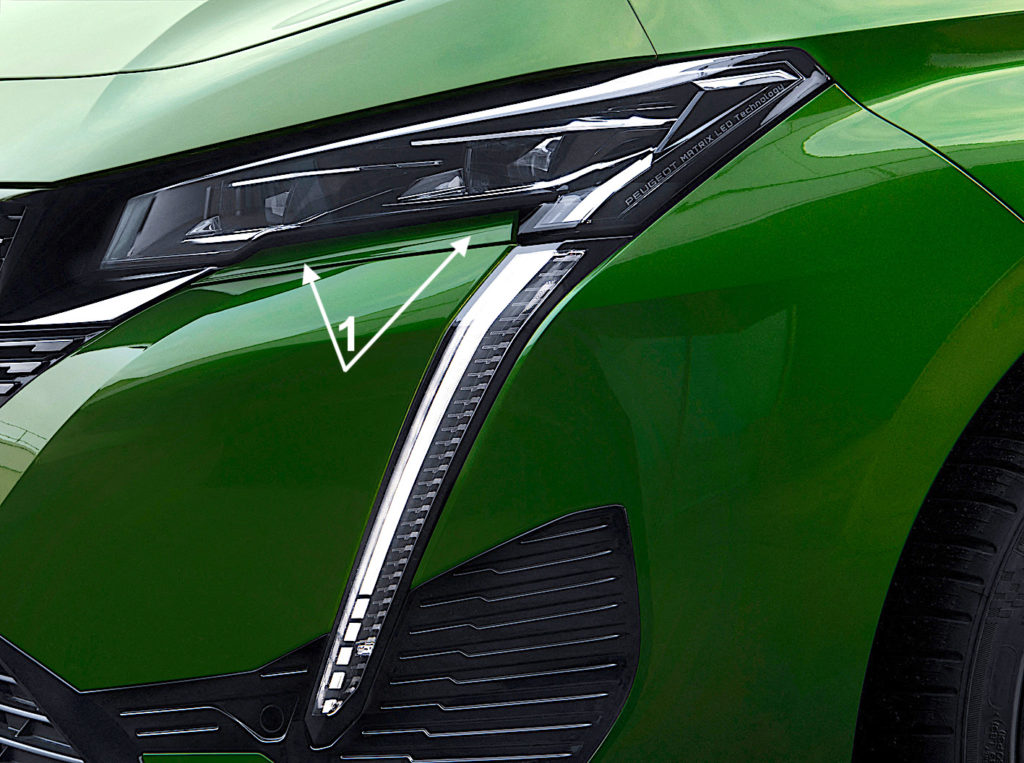
The headlamps are Matrix type, only 7 cm high, but when this option is not chosen, they are replaced by slightly higher headlamps that take up the space defined here by the small trim strip (1)
Finally, Pierre-Paul Mattei concludes that “this new 308 has a much more seated posture than the current 308. The only way to offer this posture with its marked hips was to work with the technical teams to increase the lateral overhang to retract the bottom of the cabin, to have the possibility of sculpting the wings. We are no longer in the register of the previous 308. The design brings a lot of strength to the car, and to that we add the very fine light signature with the new interpretation of the claw, more horizontal, more three-dimensional, which changes the register.“
Discover the new 308 from every angle
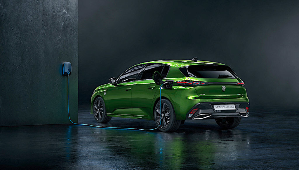
DON’T MISS THE LIGNES/auto#03 IN MID APRIL WITH A REPORT ON THE MAKING-OF THE 308 AND AN INTERVIEW WITH THE COLOURISTS WHO RECount THE BIRTH OF THIS LAUNCH COLOUR, OLIVINE GREEN. INFORMATION ON THE PUBLICATION OF THIS NEW BOOK ON YOUR WEBSITE AND ON https://lignesautoeditions.fr
ON BOARD
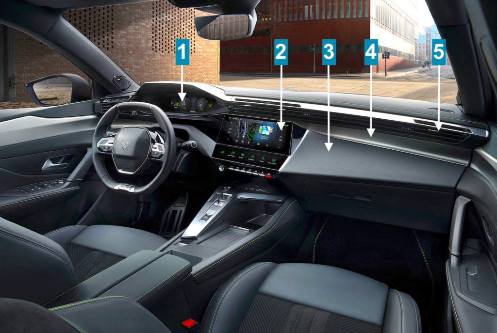
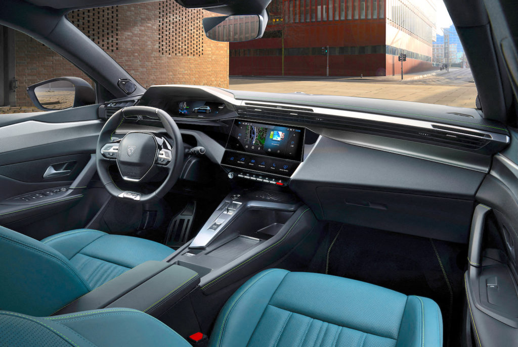
The dashboard is composed of three layers, like those of the 208 and 508, to provide a more generous decor area.
-1 The 10-inch screen is customisable and the 3D effect is accessible at the GT level.
-2 The 10-inch central touchscreen has another thin screen at its base with six programmable touch-sensitive shortcut keys: this is the innovation of the i-Toggles.
-3 The board module integrates the screen
-4 The decorative part can be covered with real aluminium, depending on the version.
-5 The air vents are located at the top for reasons of efficiency
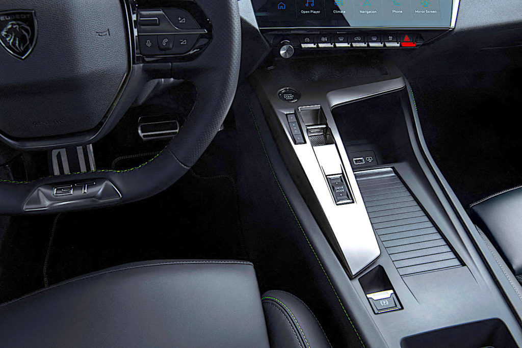
The 308 offers numerous storage compartments: on the passenger side, from the armrest to the dashboard, one metre of shelf space is devoted to them. On the left-hand side, the gearbox, starter and automatic brake control panel is in the form of an aluminium bracket at the top of which is located the smartphone charging unit by induction. This means that it does not take up any storage space.
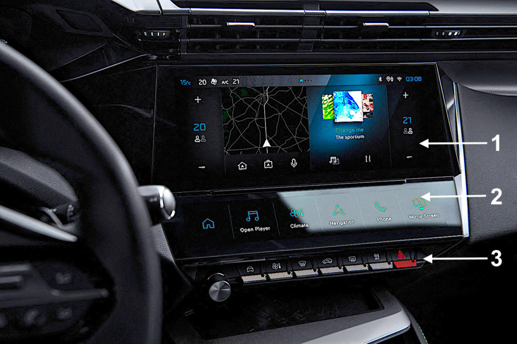
The central screen and its i-Toggles :
-1 The 10-inch touch screen, intuitive and customisable like your smartphone
-2 The i-Toggles screen, customisable shortcuts like apps or widgets on your smartphone
-3 The usual physical Toggles, with their function much more readable than on 208.
